Forget about that Mars and Venus nonsense. I reckon the one of the biggest differences between men and women involves colour.
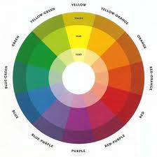
Men tend to see colour from a discernable spectrum point of view: red, orange, yellow, green, blue, indigo and violet. Variations to that are based on tonality: pale blue, light blue, dark blue, perhaps even navy blue. Pink and gold are acceptable. And don’t forget black, white and grey for which men see 256 shades, rather than the 50 that fascinate women. I think it’s a nice straightforward approach to colourific calibration.
Women? Different story. Every possible variation of colour, whether based on the spectrum or intensity, has a name: aubergine, cerise, aquamarine, ecru and millions of others. Goodness me, what’s the difference between primrose, lemon and yellow? There are dozens of names for shades of beige. What’s that all about? Even Australian cricket commentator and beige aficionado Richie Benaud probably doesn’t know any more than a handful of names for his adopted colour.
And who decides on this nomenclature? Is there an International Colour Institute based in Stockholm or Geneva where a panel of colour tasters sit around in a room with carefully controlled ambient lighting and agree on names for different hues?
And why the fascination with fruit? Orange I can accept as some sort of historic anomaly. It’s highly probable that that fruit was named after the colour, rather than the other way around. At least it’s unambiguous. But what is the difference between aubergine and plum, other than one’s an ingredient for moussaka and the other makes jams or chutneys?
Pantone must be anathema to women, with its orderly numbered colour range system.
But paint companies make no secret of which gender they see being responsible for decisions to purchase their products, other than primer coats. Recently walls in our house have been painted Tolaga Bay, and Darfield adorns exterior trim. That revelation should have curious readers diving for the nearest Dulux charts.
Things were much simpler back in the day when farm houses were painted white with red or green roofs. Sheds were painted grey, well on dairy farms where I lived they were. Government departments had their own limited colour selections reserved for schools, railway stations and other public buildings. It was a system that worked well to help passers-by determine who owned what premises. There was a logic and order to it all.
Children were educated about colour from what was written on the wrappers of school-issue Crayola crayons and on the menu printed on the inside of Cumberland colour pencil tin lids – which worked well as long as the boys in the class didn’t mix them up. Those were the halcyon days before we needed to worry about the subtleties of gamboge and other plagues of colour nomenclature that would engulf us once we got older.
Many a disagreement has been had in my home about what is green and what is blue. Is aquamarine green or blue? Answers please on a plain ivory, porcelain or cream-coloured envelope.
 RSS Feed